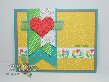
This sneak peek shows off “Cherry on Top”, one of the new designer paper collections that will be available in the 2015-2016 Annual Catalog. Three of our new In Colors show up in this collection – Cucumber Crush, Watermelon Wonder and Tip Top Taupe. This paper comes in a 6″ x 6″ stack, and it is fabulous with the stamp set “Sprinkles of Life”, which I have also used here.
Do you notice how perfect my banner edges are? (Now there’s a question I have never asked before!) The ends are punched with a new punch, the “Banner Triple”. It punches a perfect banner end on three different strip widths – 1″, 1 1/2″ and 2″. Love that!!
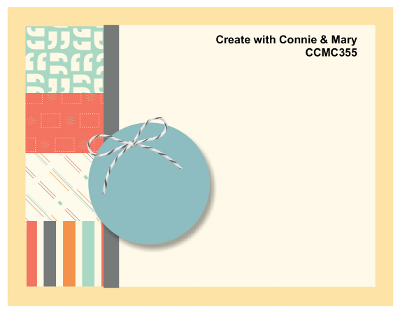
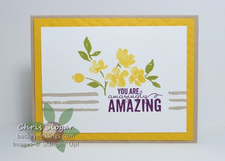
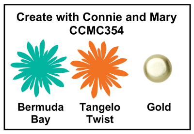
We have a really fun sketch challenge this week at Create with Connie and Mary. I was anxious to fill those blocks on the left with designer paper – what a great opportunity to use several patterns!
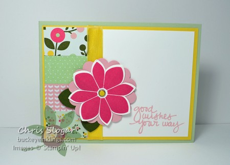
I chose paper from the All Abloom paper stack. I am trying to get my fill of Pistachio Pudding and Strawberry Slush as they head into retirement. I got the flower from “Petal Potpourri”, another of my favorites that will not be carried over. I just love those flowers and the convenience of the coordinating Flower Medallion Punch. The greeting is from “Lovely Amazing You”.
Thank you for checking out my challenge card! You can see all of the Challenge Team inspirations at Create with Connie and Mary. Please take a minute to check out what these talented ladies have created. You can also see the entries as they come in, and we’d love to have you play along with your own entry!
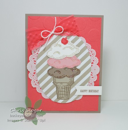
Today I want to show off some product from the upcoming 2015-2016 Annual Catalog. The set I used to make this ice cream cone is going to be popular – it is “Sprinkles of Life”, a set of 22 photopolymer stamps that can be used to build cupcakes, flower baskets, ice cream cones and even trees.
The set includes some adorable accessories and eight sentiments. It really packs a lot in for $21.00, and even better, this is the Ronald McDonald House Charities set. Stampin’ Up! will donate $3 from each sale to RMHC.
Can it get even better? Yes…there is a builder punch that coordinates with this set. The punch cuts 7 shapes from this set. I used it for the ice cream and the cherry.
Did you notice any of the other new product? The card base and mat are made with two of the new In Colors – Tip Top Taupe and Watermelon Wonder. The lace is a new coordinating trim. The diagonal stripe paper behind the ice cream cone is one of the new designer paper stack patterns.
I will sprinkle more sneak peeks into my posts through May – there is a lot of great stuff coming in the new catalog!
New subscribers get 50% off their first two months of Paper Pumpkin when signing up between now and June 10, 2015. Click here and use the promo code SAVE50. Your final cost in the first two months will be $9.98 + tax (shipping is included).
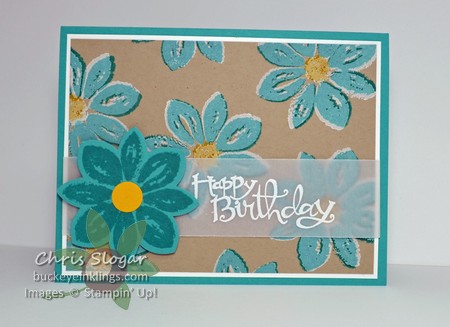
“Painted Petals” was my first purchase out of the Occasions Catalog, and I am sad to say that it will not be carried over into the new Annual Catalog. The set has been a favorite for me, and this card was a favorite in last month’s Card Buffet.
The card is so simple, four stamps from the set in four colors – Old Olive, Crushed Curry, Crumb Cake and Blackberry Bliss. You can get this set in Photopolymer, so the stamps are completely clear. This makes it so easy to place the flowers among the leaves. The main panel is a 3 1/2″ x 4 3/4″ piece of Whisper White. I CASEd the design from a note card I saw on Pinterest by Brenna at lifeafterlaundry.com.
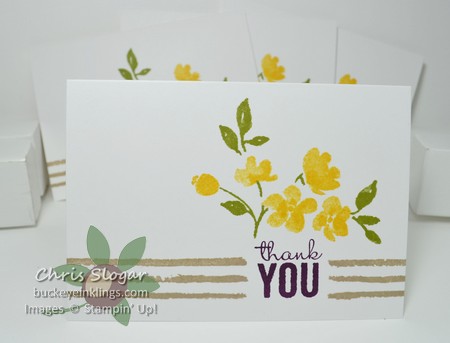
I have also been stamping these images directly onto our Whisper White note cards. They measure 3 1/2″ x 5″, and they are just right for a one-layer greeting like this.
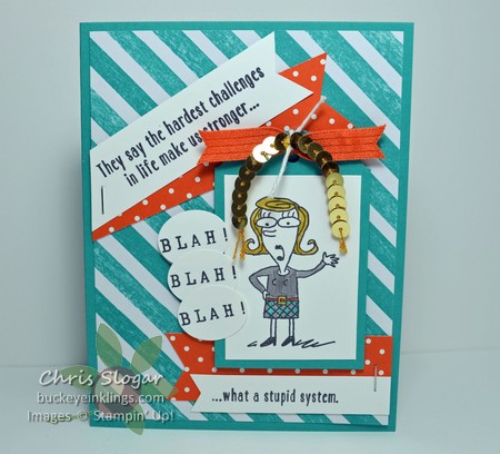
This week’s challenge is a bright color challenge, just right for the sassy gal in “Just Kidding”.
She would definitely say, “Blah! Blah! Blah!” to the first half of this sentiment! I stamped those words with the rotary alphabet stamp, and I punched them out with the small oval punch.
Click here to see what our talented Challenge Team did with these colors, and stop back to see the entries through the week…or better yet, play along!
This was another of last month’s club projects. The card itself is a CASE of Darlene McCallum’s card that I saw on Pinterest. You can see her post and another great example of this technique here.
The technique is called ghosting. It creates a white shadow around an image. In this case, I used the dots stencil, and I used a dauber to fill in the dots with ink from my Whisper White pad. When that was dry, I offset the stencil and used a dauber to add color from my Calypso Coral, Daffodil Delight and Bermuda Bay ink pads.
The piece between the 2″ Bermuda Bay circle and the greeting is heat embossed in white on vellum. The stamp is from “#hello”, but I punched with my 1 3/4″ circle instead of the 2″ circle size that is intended for the set. Since I planned to overlay a different greeting, it didn’t matter that I was cutting into the words on that image.
You can do this technique with stamps, too. Here I used a stamp from “Petal Potpourri”, first in white, and then in Bermuda Bay.
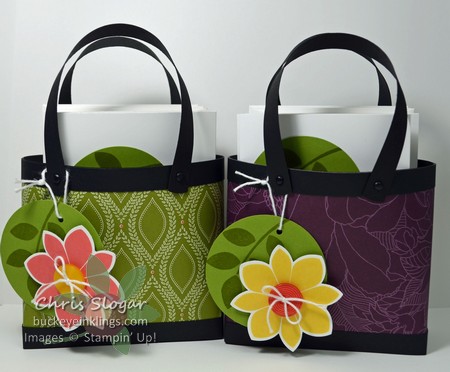
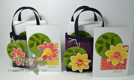
We made these adorable little tote bags at my April club meetings They are shown here with a set of four note cards and envelopes, but you could use them for other gifts and favors, too. I used Park Lane designer series paper, and I picked a stamp from “Petal Potpourri” to use on my coordinating tag and note cards.
As I have mentioned before (many times!!)…I love it when a project shows off both sides of the designer paper! I didn’t get a picture, but you can see this in the video – these purses have beautiful linings just because the paper is printed on both sides. The note cards in each bag also use a square of designer paper from the collection.
Speaking of the note cards, our 3 1/2″ x 5″ note cards come cut and scored, ready to use! There are 20 in a pack for $5.95, and they come in Whisper White or Crumb Cake. They are easily one of my favorite things in the catalog, but also easily missed!
If you happen to have any designer paper laying around (ha!), you have to try this project! It only takes a 4″ x 12″ piece, and it is so easy. If you don’t have 12″ strips of cardstock for the trim pieces, use a coordinating piece of designer paper for the trim.
I have to leave you with this funny picture that my sister sent me this weekend…
Don’t you love it?! Unfortunately, my UPS man comes around dinner, and my husband is usually home in time to notice the deliveries. I do always mention that many of my orders are for customers, but it’s hard to hide my growing personal stash. Wherever you live, I hope you are at the start of a UPS route!