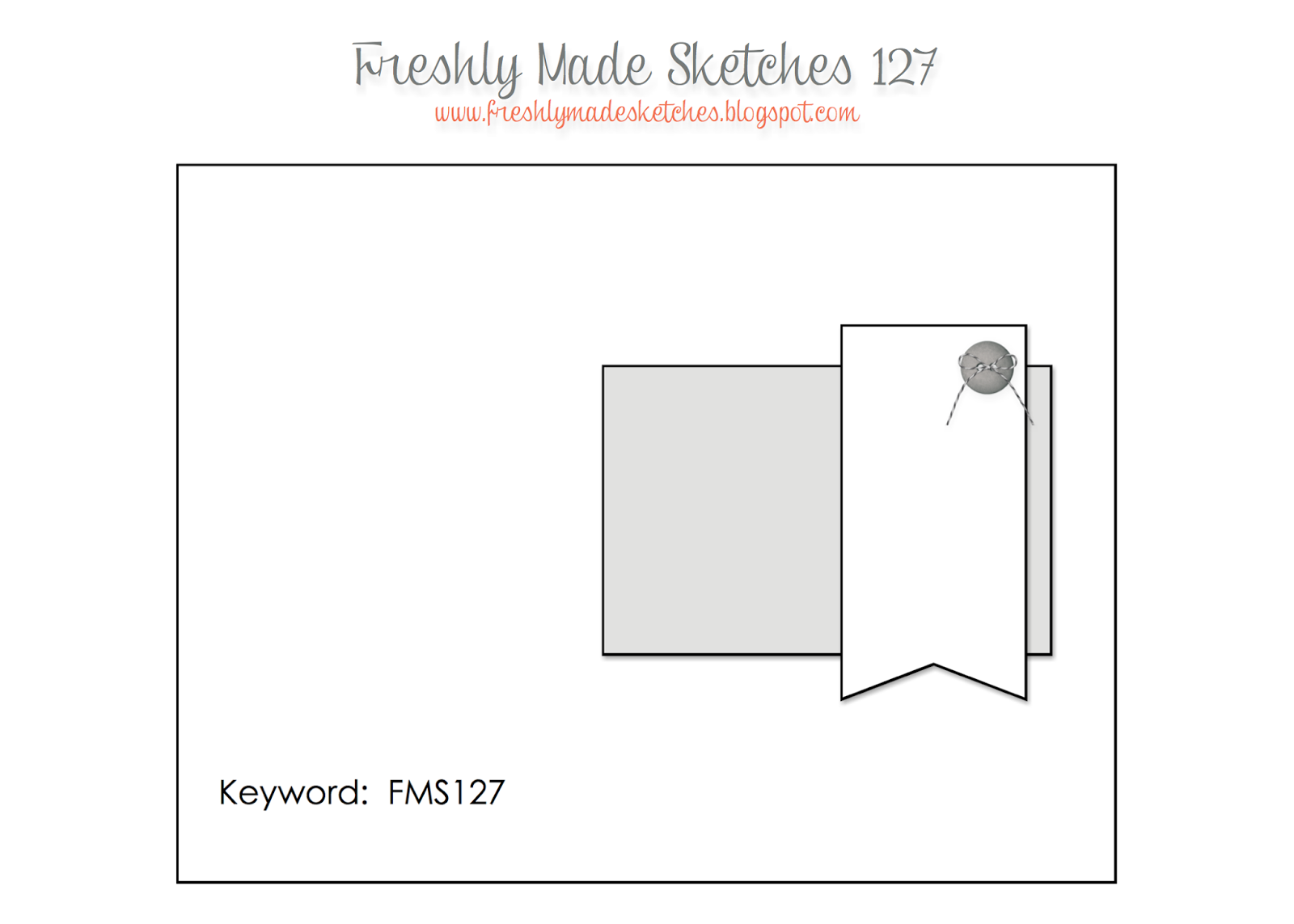
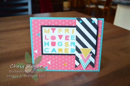
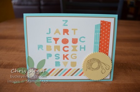
In this layout, Jen T. gives us a great way to highlight a small element on the right side of this card. However, in my version, the matted piece under the banner grabs the attention.
Hopefully, the letters for “LOVE YOU” jump right out at you. That is the main message, but I also played around with the placement of the other letters to make other hidden words.
The letters are from the photopolymer set Sans & Stripes. They coordinate nicely with the Kaleidoscope designer paper and the Geometrical stamp set. These letters would be a fun background even if they were placed randomly and didn’t spell anything. Of course, they are great for personalizing cards and scrapbooking, too. How many times do we need a different word than we have available?
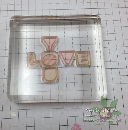
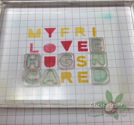
It is easy to lay out the Sans & Stripes letters on grid paper. Keep scrolling for pictures of the process.
The letters occupy a 1/2″ square. I lay out the message first, placing the letters face down. When I am happy with the message, I just pick them up with my block.
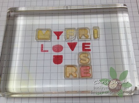
I stamp the message and then build around it. Having the message stamped on the grid paper helps if you are trying to add other words.
Keep filling in letters until your grid is the size you want. It’s fun to use color to highlight the main message. I also did that in the following example, and I hope you can see the message. My family didn’t get it right away, but they are not into word puzzles like I am! The irregular border around the grid of letters is a nice contrast to the very organized grid.
You can check out more designs that are based on this sketch at Freshly Made Sketches. Have a great weekend!

