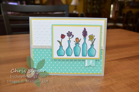
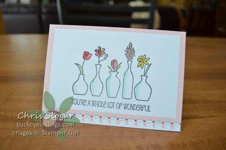
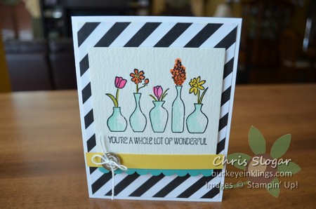
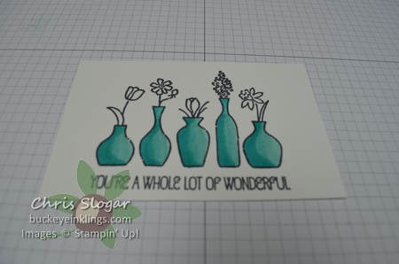
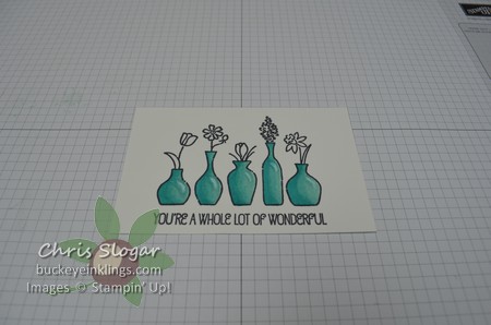
I have colored this image before, but this time the colors are really vivid on the “Vivid Vases” image. On previous samples, the image looked nice with subtle color from the blender pen. The examples I posted before are shown below.
While I could have added more color to either of these, especially on the vases, I couldn’t have achieved the streak-free saturated colors I am showing today. Today’s image was colored with our new line of Blendabilities markers. They are pictured in the new Annual Catalog, and the skin tone assortment will be available with the release of the catalog on June 2. The other color collections coordinate with our current colors, and they will be available shortly after the release of the catalog – I will keep you posted!
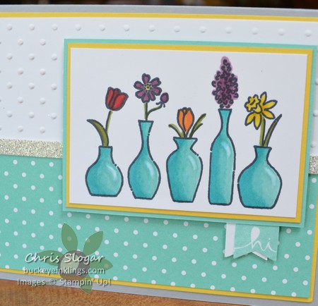
Here’s a closer look, and you can see how nicely the Coastal Cabana coordinates with the designer paper. Each color comes in a pack of three shades, with one of the shades matching the color very closely. The others two shades create the blended look. I have a series of pictures below that show how I colored the vases.
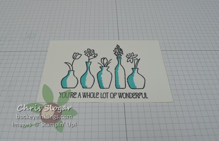
I started with the darkest color, applied on the dark side of the vases with a small circular motion.
I added the medium color.
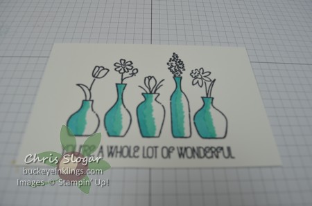
Finally, I added the light color, on the side of the vase that faces my imaginary light source. Note that you can see a line between colors, but within each strip of color, you don’t see strokes.
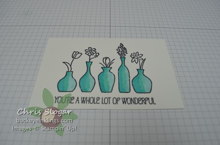
Then, with the lightest color, I colored over all of the colors, blending most at that line between colors.
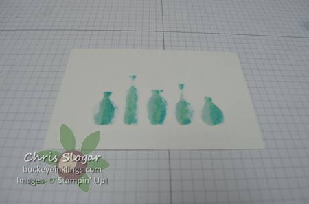
If you are doing it right, here is what the back of your Whisper White cardstock looks like. You will definitely want some scrap paper under your project as you do this. This looks very wet, but even though you do color over the same area more than you could with a water-based marker, these alcohol markers do not damage or “pill” the cardstock.
I thought my dark side wasn’t dark enough, so I went back over it with the dark shade and then blended the edge of the dark color, again using the light shade to blend.
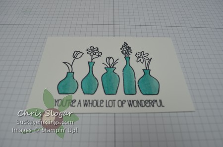
The last step was to add the little highlight with the Color Lifter. The Color Lifter works a bit like an eraser, pulling color out of an area.
Once again, the finished image.
I did use two shades on the tulip and the daffodil, but I didn’t spend time blending on the flowers. You can color with a single shade without the worry of brushstrokes on the small elements. This will be especially great for faces done with the skin tones!!

